![[2026] Shopify Instant Checkout: ChatGPT, Shop Pay & Buy Now Button](https://bogos.io/wp-content/uploads/2026/07/Shopify-instant-checkout-400x225.jpg)
Charlie Ngo
•
Last updated: 8 July, 2026
[2026] Shopify Instant Checkout: ChatGPT, Shop Pay & Buy Now Button
Shopify instant checkout means three different things, and the most important one changed in 2026. It can mean buying...
Shopify Checkout Optimization: 9 Ways to Boost Your CR (2026)
Marketing Manager
Summarize this post with AI
Your Shopify checkout is where the sale is won or lost. Shoppers have already said yes. Then many of them leave before they pay. Shopify checkout optimization is the work of removing the friction that makes them go. This guide shows you why people abandon checkout, how to measure your own leaks, and the fixes that lift both conversions and average order value. I’m Charlie Ngo, and I’m BOGOS’s Marketing Manager. We build promotion and conversion tools for Shopify stores, so checkout friction is something we study closely.
You cannot fix what you have not measured. So before you touch a single setting, understand where your money leaks and why. This section gives you the data and the baseline you need.
The average documented cart abandonment rate is 70.19%. That figure comes from Baymard Institute, averaged across 49 separate studies. In plain terms, for every 10 people who add an item to their cart, only about 3 buy.
Not all of that is your fault. Many shoppers are just browsing or comparing prices. That part you cannot fully control.
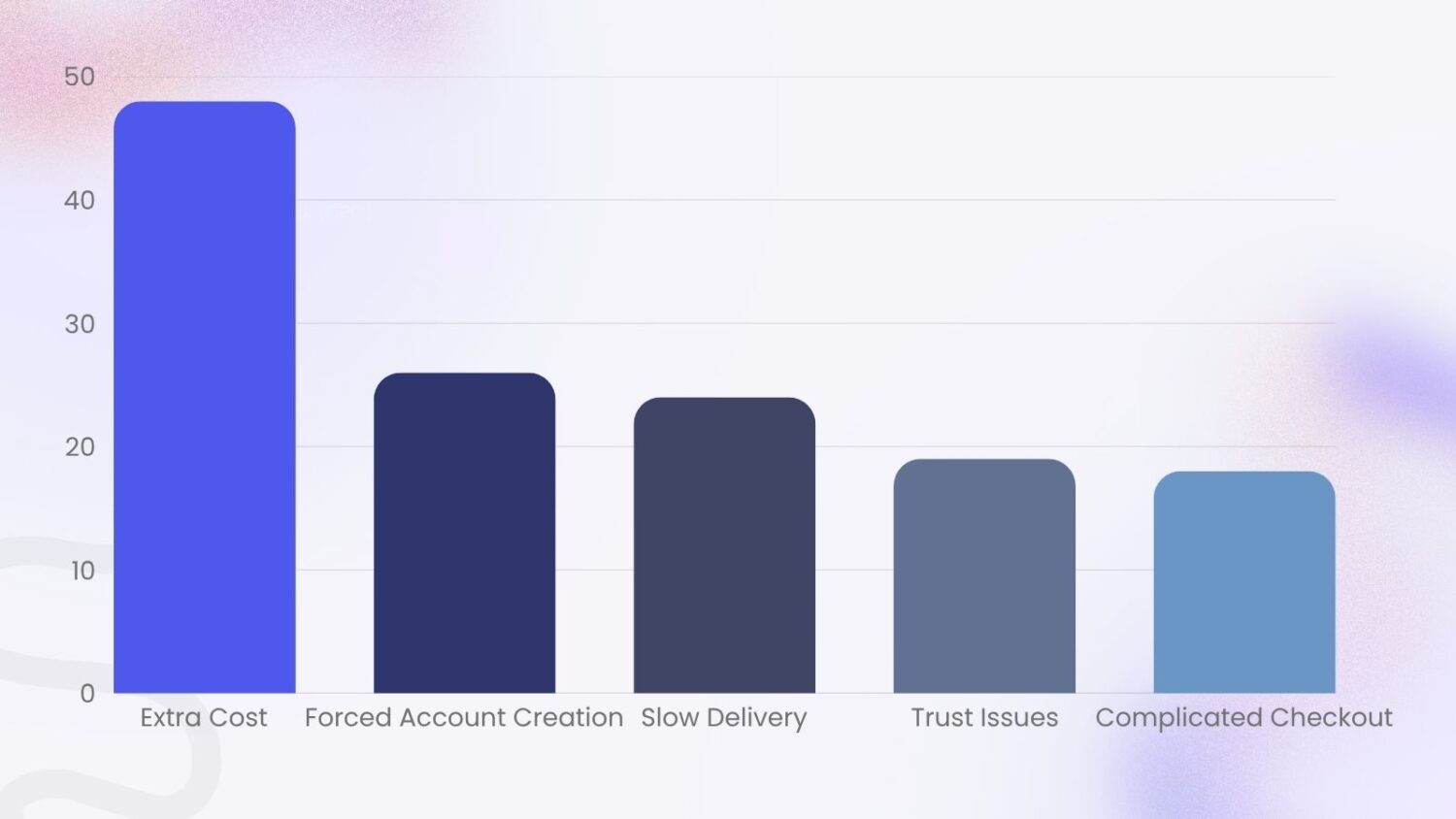
But the rest is fixable. When Baymard asked shoppers why they abandoned checkout, and set aside the “just browsing” group, a clear pattern showed up. These are the main reasons people leave a checkout:
Look at that list again. Almost every reason is something you can change.
Baymard puts a number on the upside too. Across large stores, fixing known checkout usability problems can raise conversions by up to 35.26%. For the US and EU combined, that is roughly $260 billion in recoverable orders. Your slice of that is real money.
Start with one number: your checkout completion rate. It tells you how many people who reach checkout actually finish.
The formula is simple:
Checkout completion rate = (completed orders ÷ checkouts started) × 100
A high number means your checkout is doing its job. A low number means buyers are reaching the finish line and walking away.
Benchmarks help you read the result. The average Shopify store conversion rate is about 1.4–2.4% for visitors who buy. Checkout completion runs much higher, since those shoppers have already shown intent, and good stores push that figure up over time. Treat any benchmark as a starting line, not a target. Your own baseline matters more than the average.
Then find your drop-off point. Shopify shows this for you. Go to Analytics, then Reports, and open the checkout conversion or behavior reports. They show how many people move from cart to checkout to payment to confirmation. The biggest gap between two steps is your weakest link. Fix that first.
One more habit: place a test order yourself. Do it on mobile. Buy a real product, feel the friction, and note every moment you pause. That walk-through tells you things no chart can.
Now the fixes. Each one below targets a specific reason people abandon. Work through them in roughly this order, because the early ones address the biggest causes. Checkout work is some of the highest-leverage conversion rate optimization you can do, because the shopper has already chosen to buy.
Hidden costs are the number one reason shoppers quit. Nearly 48% leave when shipping, tax, or fees appear late.
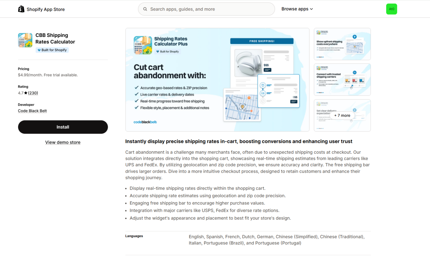
So stop surprising people. Show shipping estimates on the product page and in the cart, not only at the final step. Display tax where you can. Make the total feel honest from the start. You can showcase the estimated shipping fee in the cart by using the CBB Shipping Rate Calculator Shopify App.
This also begins before checkout. Clear pricing and shipping notes on your product pages mean the cart total never feels like a trap.
Free shipping is the strongest cure for sticker shock. A Forrester study for Shopify found free shipping influences about 75% of global shoppers.
But free shipping on every order can hurt your margins. So set a minimum. “Free shipping over $50” protects your profit and gives shoppers a reason to add more. The same Shopify research found a free-shipping threshold nudges around 58% of people to spend more.
You can also protect your margin from the other side. Cap the offer so it does not apply when shipping itself runs high. Heavy items, bulky orders, and far or international destinations cost more to ship. Exclude those from the free-shipping deal, or set an upper order limit, so a few expensive shipments never eat your profit.
The trick is to make the threshold visible. A progress bar that says “You’re $8 away from free shipping” turns a cost worry into a small goal. Bellwoods Brewery used a $60 threshold with progress bars to lift order values while removing shipping costs for customers. Dreamland Jewelry went further and saw a 37% lift in conversions after offering free shipping on all orders.
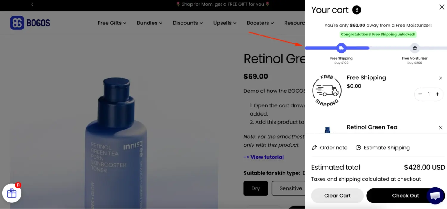
This is where the free-shipping lever does double duty. It removes the top abandonment cause, so it lifts conversions. And it pushes carts higher, so it lifts average order value. Our app can set the threshold and show the free-shipping progress bar for you, so shoppers always know how close they are.
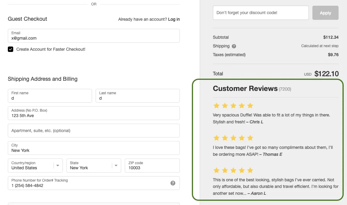
Forced sign-ups cost you sales. About 26% of shoppers abandon when a store makes them create an account.
Guest checkout fixes this. It lets a shopper buy without making an account. They enter only what the order needs: email, shipping address, and payment. No password. No profile. They pay and they are done.
So let people buy as guests. Make “Continue as guest” the obvious choice, not a tiny link hidden under a sign-in form.
Then ask for the account after the order, on the thank-you page. At that point you already have their email and address. Creating an account only means adding a password. The ask feels like a service, not a hurdle.
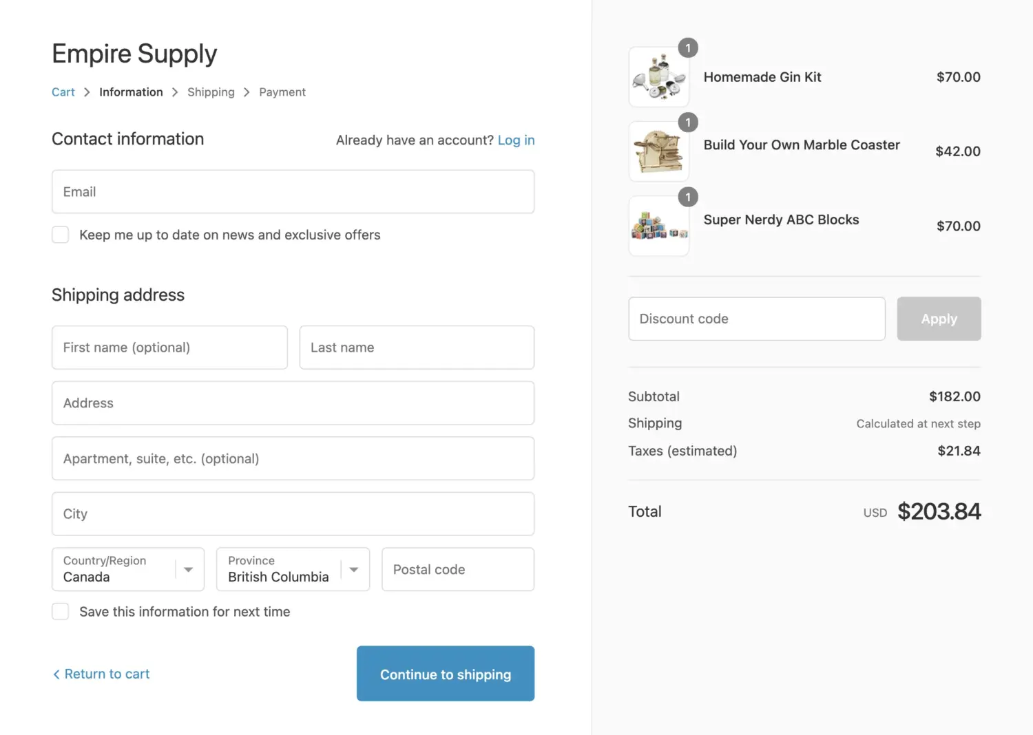
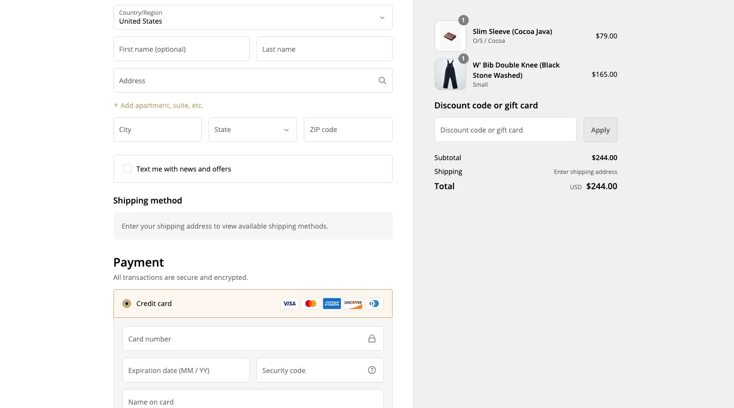
Every extra field is a chance to lose someone. The ideal checkout uses about 12–14 form elements, or 7–8 if you count only the fields you type into.
Most stores ask for far more. The average checkout shows 23.48 elements by default. That is a lot of friction.
So trim it. Keep only the fields the order truly needs. For most stores, the essentials are:
Phone number is optional for many stores, so make it optional or drop it. Skip a separate billing address when it matches shipping. Skip “company” and “address line 2” unless you need them.
Then turn on address autocomplete, which Shopify offers in your checkout settings. It fills in the town, state, and ZIP from the first line of an address. Less typing means fewer errors and faster checkouts.
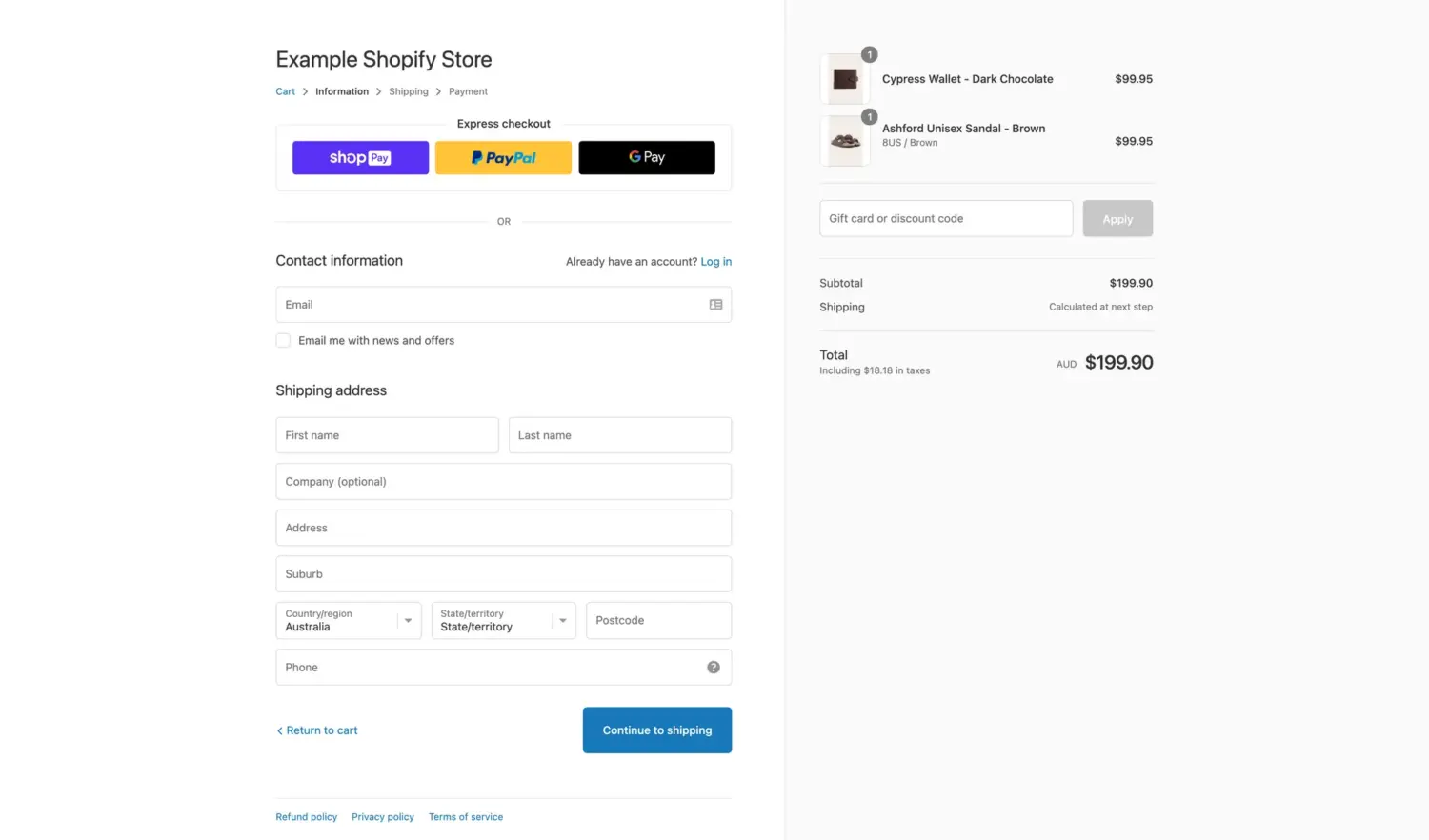
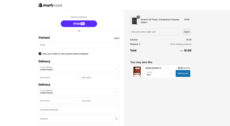
First, what these are. Shop Pay is Shopify’s own accelerated checkout. A shopper saves their email, address, and payment once. After that, any Shopify store that offers Shop Pay recognizes them and fills in everything for them. Express checkout is the broader term for these one-tap options: Shop Pay, Apple Pay, Google Pay, and PayPal. They skip the long form and let a known buyer pay in a tap or two.
Shop Pay is the single highest-impact switch most stores can flip. It saves a shopper’s details and lets returning buyers check out in one tap.
The numbers are strong. An independent study for Shopify found Shop Pay can lift conversions by up to 50% compared to guest checkout, and it beats other accelerated checkouts by at least 10%. Even when a shopper does not use it, the mere presence of the Shop Pay button can raise lower-funnel conversion by about 5%.
A newer Shopify figure is more modest but still meaningful: an average 9% lift across all checkouts and an 18% higher rate for returning customers. Treat the big numbers as a ceiling and the smaller ones as a floor. Either way, the direction is up.
Place express buttons, Shop Pay, Apple Pay, and Google Pay, high on the page. Above the fold. Not buried at the bottom.
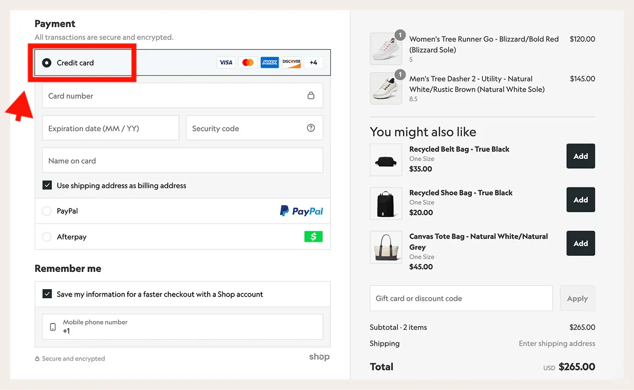
People abandon when they cannot pay their way. Offer the options your buyers actually use: cards, PayPal, Apple Pay, Google Pay, and buy-now-pay-later services like Klarna or Affirm.
This works. Sydney So Sweet added more payment options and saw average order value rise 21%, along with fewer abandoned carts. Show the payment logos too, so shoppers spot their preferred method at a glance.
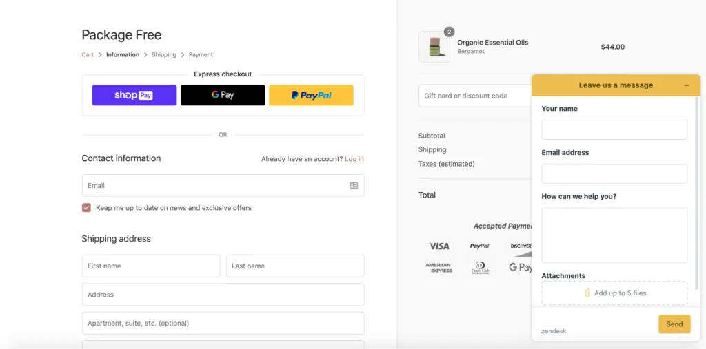
Around 19% of shoppers leave when something about a checkout feels unsafe. Trust signals answer that fear before it grows.
Put the reassurance near the pay button, where the doubt lives. A short return line like “Free returns within 30 days.” A plain delivery estimate like “Arrives in 3–5 business days.” Security badges that signal a safe payment.
Reviews help here too. A few real customer ratings at checkout remind the shopper that other people bought and were happy. Strong social proof lowers the perceived risk of clicking buy.
One caveat: Shopify controls the checkout page tightly. You cannot edit it freely the way you edit a theme page. Instead, you add trust badges, reviews, and short reassurance lines through the checkout editor and approved checkout apps, and only in the spots Shopify allows. Basic, Shopify, and Advanced plans get a limited number of these blocks. Shopify Plus gives you more room and finer control. So plan your trust signals around what your plan permits, and put your highest-impact one closest to the pay button.
First, what it is. A one-page checkout puts every step, contact, shipping, and payment on a single screen. The older multi-step checkout split these across three separate pages, so the shopper clicked forward again and again. The one-page version removes those page loads. The shopper sees the whole path at once and fills it in without waiting.
A shorter flow means fewer chances to reconsider. No repeated pauses where a shopper drifts off. Each extra page was another exit door, and one-page checkout closes most of them.
Shopify now offers a one-page checkout, so you may already have it. If your store still uses a multi-step flow, test the single-page version and compare. Watch your completion rate and your average order value side by side.
Mobile is where most sales start and where most sales die. Treat it as its own project, not a shrunk-down desktop page.
Most shopping now happens on phones. About 68% of online orders are placed on smartphones, based on Statista data.
Yet phones convert worse. Shopify reports mobile conversion around 3.0% versus 4.4% on desktop. Small screens, slow loads, and thumb-typing all add friction. Every flaw you tolerate on desktop hurts twice as much on mobile.
Fix mobile on its own terms. Here is where to start:
The fixes above win more orders. These next moves make each order worth more. They are AOV plays, not conversion plays, so keep them separate in your mind. The goal here is a bigger cart, not a higher completion rate.
A checkout upsell, sometimes called an order bump, offers a small add-on right before payment. Gift wrap. A matching accessory. A protection plan.
Keep it relevant and light. If someone buys shoes, suggest socks. One or two offers, not ten. Too many turn a clean checkout into a cluttered one, which hurts the very conversion you worked to win.
Our BOGOS app handles this with a checkout upsell feature. It shows a targeted offer on the checkout page itself. The shopper adds it in one tap, with no trip back to the cart. You can trigger the offer by what is already in the cart or by a spend tier, and style it to match your checkout.
The same limit from earlier applies here. Upsells placed on the checkout page need Shopify Plus, the only plan that allows changes there. On other plans, you can run the same play on the cart page or the thank-you page instead. Our checkout upsell setup adapts to the plan you are on.
The best moment to upsell is right after the order. The wallet is already open. The risk is gone, because the first order is safe.
So offer a one-click add-on on the thank-you page. A second product, an upgrade, a free gift with purchase above a spend tier, or a bundle deal. These offers add revenue without touching your checkout friction at all.
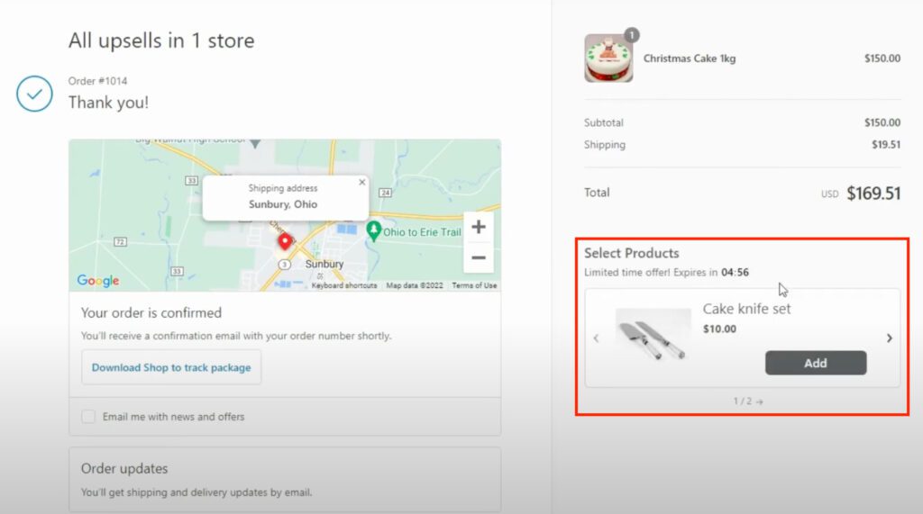
Numbers make this concrete. One BOGOS merchant, Missing Pen, used gift and offer logic to earn roughly €36,000 in extra revenue and a 19% AOV lift. Another store, Aotea Gifts, saw about 70% higher average order value over 90 days.
Those gains came from bigger carts, not more traffic. That is the point of AOV work. It grows revenue from the shoppers you already have.
A common myth is that you need Shopify Plus to change your checkout. That is not true anymore.
On Basic, Shopify, and Advanced plans, you can still do a lot. You can brand the checkout with your logo, colors, and layout in the checkout editor. You can use Shopify’s one-page checkout. And you can add apps and checkout extensions for things like progress bars, trust badges, and upsells, within a set limit on the number of extensions.
Shopify Plus unlocks the deepest control. That includes custom fields, more checkout extensions, and finer control over the checkout flow and post-purchase pages. If you run a larger or more complex store, Plus gives you room the lower plans do not.
The takeaway is simple. Most of the high-impact fixes in this guide, guest checkout, transparent costs, Shop Pay, fewer fields, work on every plan. Start there.
Checkout optimization is never one and done. It is a loop: change one thing, measure, keep what works.
Run A/B tests where you can. Change a single element, like the free-shipping threshold or the placement of express buttons. Then compare conversion and average order value against the old version. Let the data decide, not your taste.
Then catch the shoppers who still leave. Shopify can send an automated abandoned-checkout email to remind buyers of their cart. Make it useful, not pushy. Add the product, a clear link back, and a reason to return. Recovery emails turn some lost carts into sales and boost your Shopify sales overall.
A few common errors quietly cost stores money. Watch for these:
Your checkout is the last and most important step in the sale. Shoppers reach it ready to buy, then friction sends many away. The good news is that most of that friction is fixable, and the data tells you exactly where to look.
Start by diagnosing. Measure your completion rate and find your drop-off point. Then fix the biggest causes first: show costs early, offer guest checkout, cut your form fields, and turn on Shop Pay. Separate your conversion work from your AOV work, and use free-shipping thresholds and checkout offers to grow both. Test, recover, and repeat.
Do this well and you win more orders from the traffic you already have. That is the quiet power of checkout optimization. No extra ad spend. Just fewer leaks and bigger carts.
Yes. On Basic, Shopify, and Advanced plans you can brand the checkout, use one-page checkout, and add apps and checkout extensions for upsells, progress bars, and trust badges. Shopify Plus adds deeper control, like custom fields and more extensions, but most high-impact fixes work on every plan.
Treat benchmarks as a guide, not a goal. The average Shopify store conversion rate sits around 1.4–2.4% for visitors who buy, and checkout completion runs higher because those shoppers already showed intent. Your own baseline and its trend over time matter more than any industry average.
Yes, by a meaningful margin. An independent study for Shopify found Shop Pay can lift conversions by up to 50% compared to guest checkout, and even its presence on the page can raise lower-funnel conversion by about 5%. A newer Shopify figure shows a more modest 9% average lift. The direction is consistent: turning it on helps.
Shopify instant checkout means three different things, and the most important one changed in 2026. It can mean buying...
Every click to your product page is a chance to make a sale or lose a customer. A product...

ChatGPT started as a place to draft product copy. Now it does much more. Shopify has turned it into...