

Charlie Ngo
•
Last updated: 20 October, 2026
Shopify Collections: How To Create & Organize Them (2026)
Shopify collections decide how shoppers find your products, yet many guides still describe a setup Shopify is now replacing....
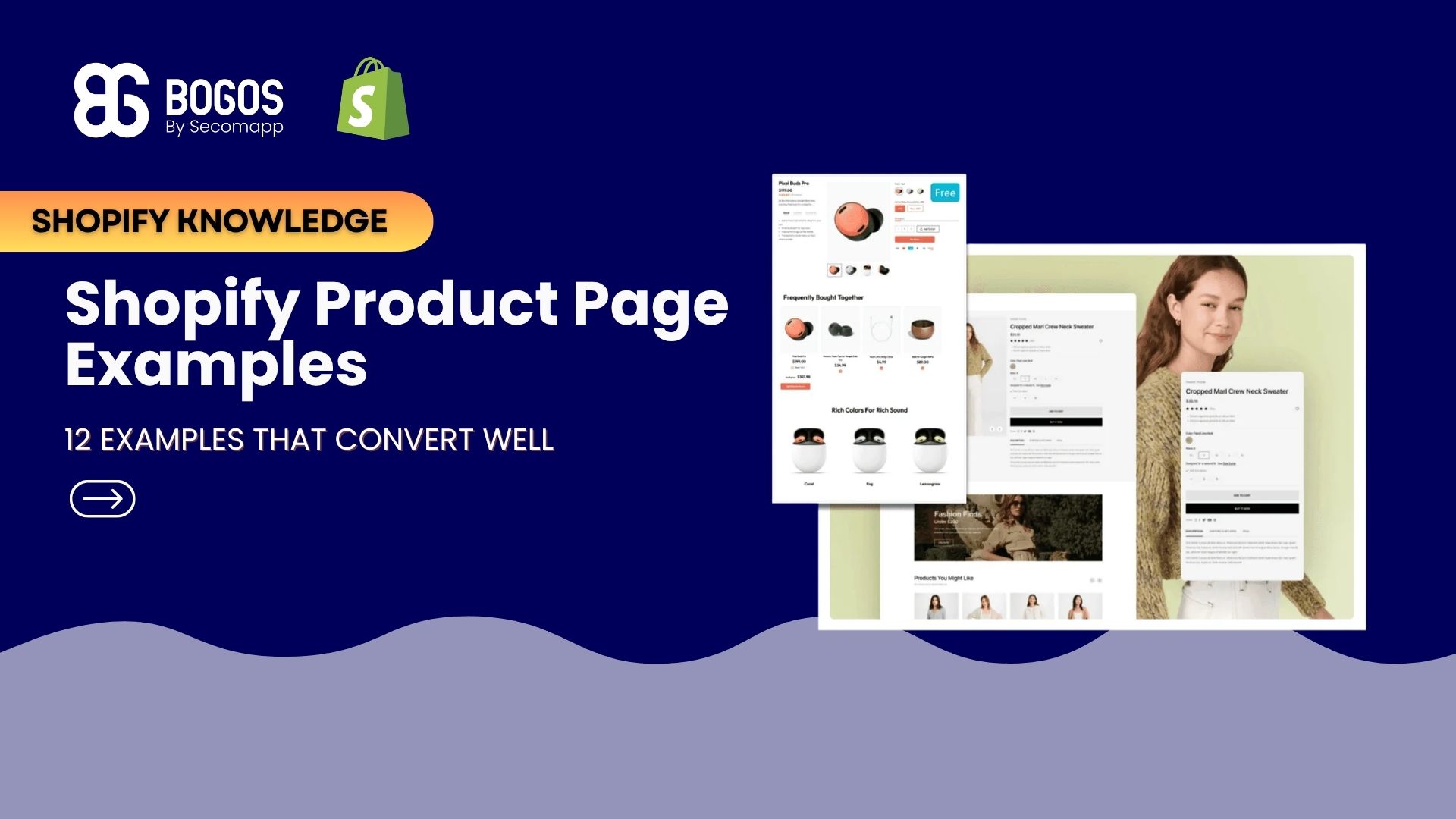
12 Excellent Shopify Product Page Examples That Convert Well

Digital Marketing Specialist
Summarize this post with AI
Every click to your product page is a chance to make a sale or lose a customer.
A product page helps shoppers trust your store by providing the information they need before making a purchase.
It also answers common questions, reducing uncertainty and returns, while serving as the final step that pushes customers to complete their purchase instead of leaving your site.
In this blog, we have gathered 12 real Shopify product page examples and why the page works.
Before the examples, it helps to know what you are looking for. Across thousands of high-performing product pages, the same building blocks show up again and again:
Spotting these conversion elements on successful stores is easy, but knowing how they built them is where the real advantage lies. You can easily reveal the exact design behind any store using the Shopify theme detector by Koala Inspector. By using Koala Inspector, you can effortlessly inspect your competitors’ apps, bestselling products, and layout strategies – and get a clear blueprint to build your own high-converting product pages.
Every example that follows uses one of these ideas well. Watch for the element you can steal. You can also check out our product page optimization guide for more tips.
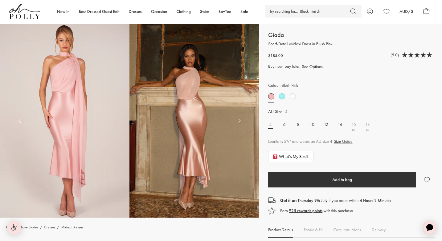
The fashion brand Oh Polly leads with vibrant, high-resolution imagery. Shoppers can click to enlarge each shot and move through a gallery view with ease. For a visually driven purchase like clothing, seeing the product clearly from every angle does most of the convincing.
The element to steal: a rich image gallery or slider. Give shoppers multiple large images, zoom, and smooth navigation so they can inspect the product the way they would in a store.
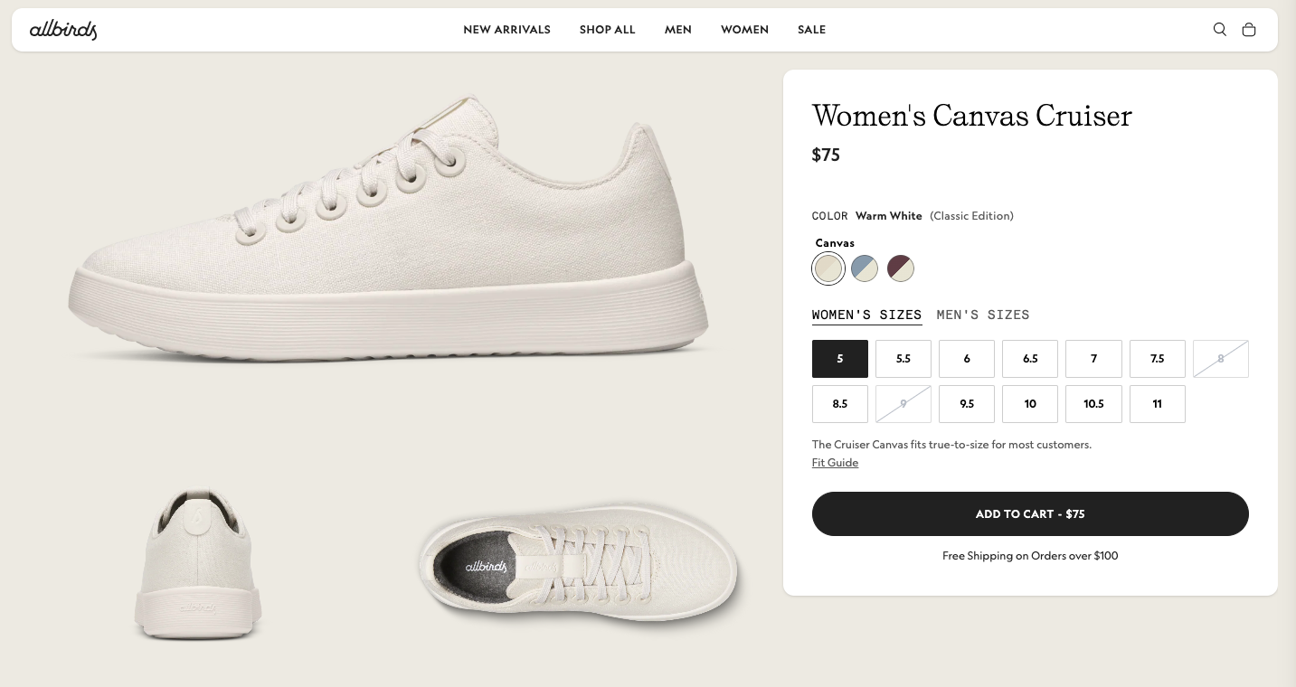
Allbirds goes beyond basic product details by explaining why the product was made, what materials it uses, and how to care for it. Dedicated sections highlight the shoe’s key benefits, sustainable materials, technical features, and care instructions, helping shoppers understand the product before they buy.
The element to steal: feature oriented product storytelling. Use dedicated sections to explain your product’s materials, benefits, and care instructions. This builds trust, answers common questions, and reduces purchase hesitation.
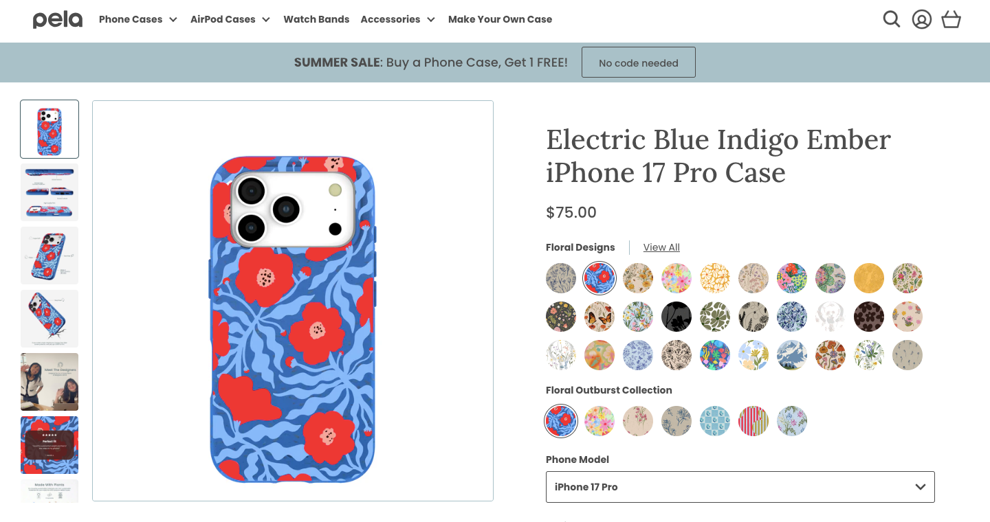
Pela makes it easy for shoppers to buy with confidence by showing everything they need on a single product page. The page combines large product images, customer ratings, clear pricing, color swatches, and a phone model selector, so customers can quickly compare options without leaving the page. This reduces friction and helps shoppers make faster buying decisions.
The element to steal: visual product variants. Display all colors, patterns, or styles as image swatches instead of text. It makes browsing easier, encourages customers to explore more options, and keeps them engaged on the product page.
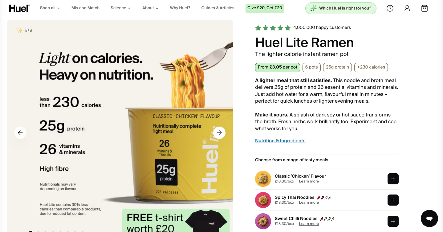
Huel makes the numbers do the talking. The product page highlights the cost per meal to answer affordability, then reinforces credibility with large-scale social proof like total customers served and total meals sold. When individual reviews are not the focus, scale creates trust and momentum.
The element to steal: a stats or social-proof bar. A simple row of strong numbers, such as customers served, units sold, or years in business, can reassure a first-time buyer fast.
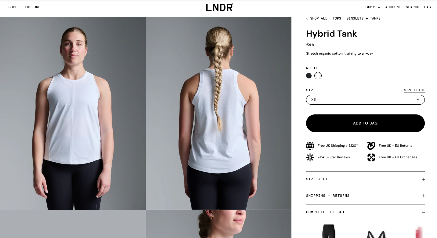
LNDR uses detailed product storytelling to remove buying friction. The page combines multiple product angles, close-up images, fit information, fabric details, certifications, and feature callouts to show exactly what customers are getting. It also recommends matching products to increase the average order value.
The element to steal: Pair close-up images with short explanations of key features, materials, and certifications so customers can quickly understand the product’s value and feel more confident buying.
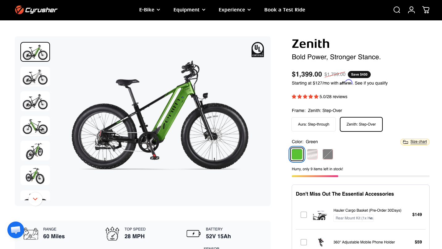
Cyrusher uses feature highlights, real images, FAQs, video reviews, customer reviews, and trust badges to answer questions before shoppers ask them. The page explains how each feature improves the riding experience, helping customers understand the product’s value and buy with confidence.
The element to steal: educational product content. Combine feature explanations, FAQs, third-party reviews, and customer testimonials on the product page to build trust, reduce purchase hesitation, and improve conversions.
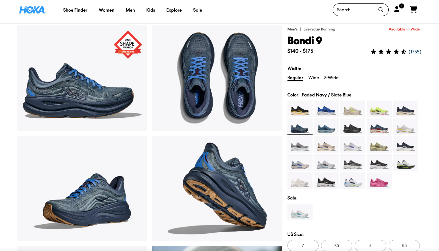
HOKA helps shoppers choose the right shoe by combining rich visuals with helpful buying guidance. The page includes multiple product images, videos, size and fit information, side-by-side product comparisons, expert recommendations, and detailed feature explanations. Instead of only describing the shoe, it explains who it is best for and how it compares to other models, making the buying decision much easier.
The element to steal: product comparison. Help shoppers compare similar products on the same page with key differences, features, and ideal use cases. This reduces confusion, improves confidence, and increases conversions.
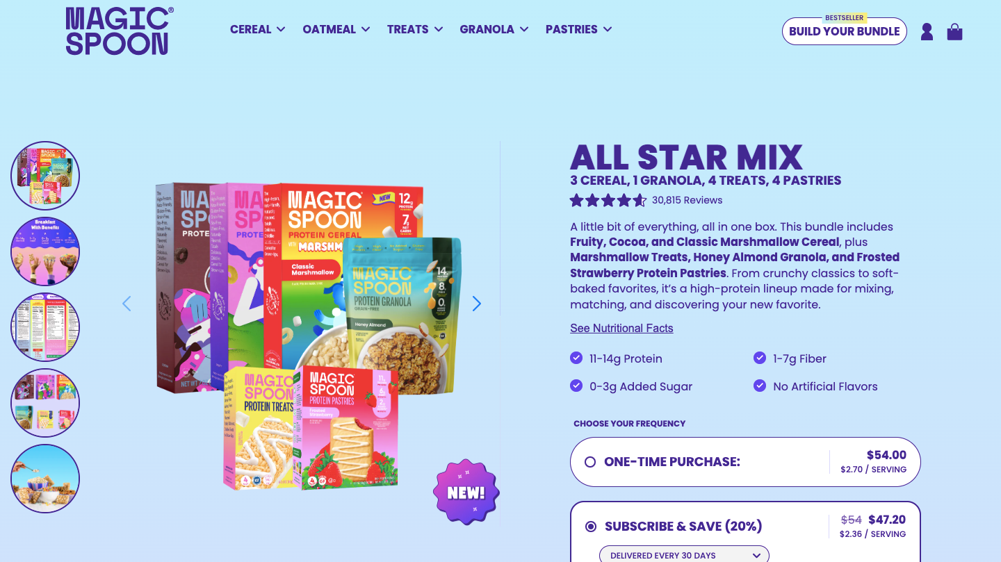
Magic Spoon makes its product page highly persuasive by combining nutrition highlights, product comparisons, subscription savings, and customer reviews in one place. Instead of simply listing ingredients, it explains why the cereal is a better choice through clear visuals and comparison tables. The page also encourages larger purchases with bundles and subscription discounts. To implement similar cross-sell tactics, you can learn how to upsell on Shopify to increase your AOV.
The element to steal: comparison tables. Show how your product compares with traditional alternatives or competitors using clear visuals and key benefits. This helps shoppers quickly understand your product’s value and makes the buying decision easier.
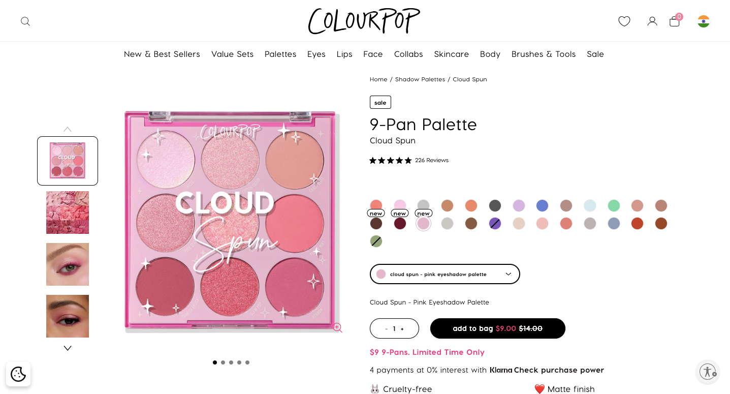
ColourPop makes it easy for shoppers to visualize the product before buying. The page includes shade swatches, close-up images, videos, user-generated content, detailed product information, and customer reviews. It also recommends similar palettes, encouraging shoppers to explore more products without leaving the page.
The element to steal: user-generated content. Showcase real customer photos and videos alongside product images. It builds trust, helps shoppers see the product in real-life use, and increases purchase.
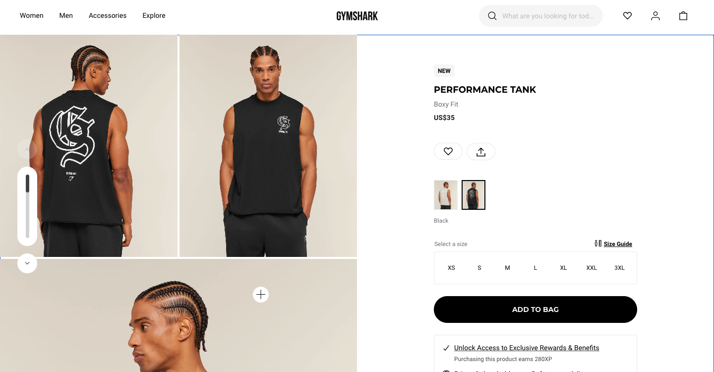
Gymshark makes it easy to see the product from the start. Instead of showing just one image, it displays the front and back of the garment side by side above the fold. Shoppers can see the full design without clicking through multiple images, making it easier to decide.
The element to steal: a multiple-angle hero gallery. Show the front, back, and key details together so shoppers can understand the product at a glance.
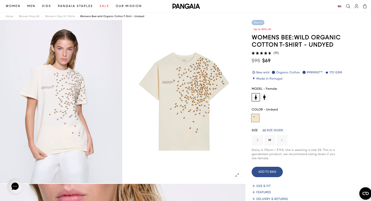
PANGAIA turns its product page into a learning experience. Instead of only describing the T-shirt, it explains the materials, fabric technology, sustainability efforts, and packaging with visuals and short explanations. This helps shoppers understand what makes the product different and why it’s worth the price.
The element to steal: educational product sections. Use visuals and simple explanations to tell the story behind your materials, technology, or manufacturing process. It builds trust and gives customers more reasons to buy.
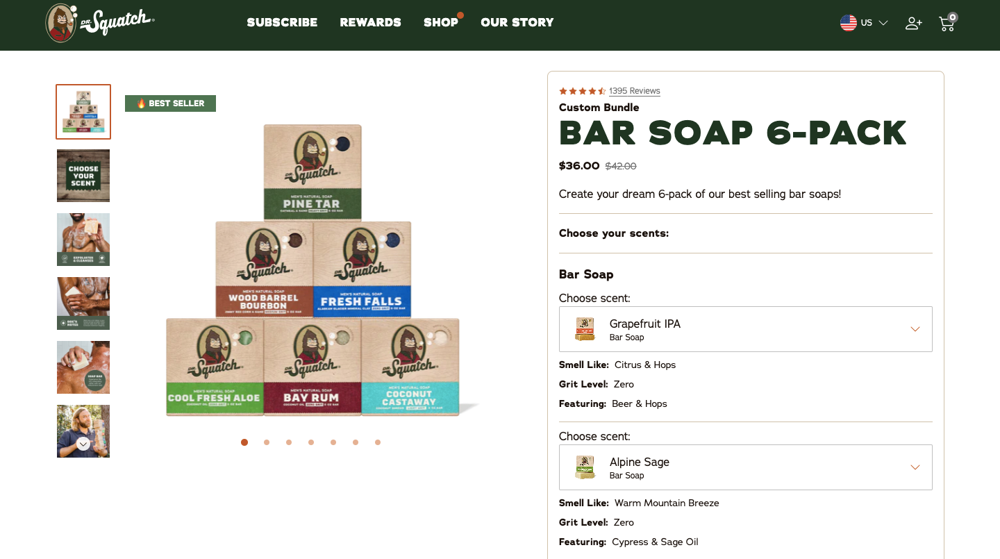
Dr. Squatch makes buying a bundle simple by letting shoppers customize every bar of soap on the product page. Customers can choose different scents, compare one-time purchase and subscription pricing, and see key product details without leaving the page. Trust badges, guarantees, and natural ingredient highlights further reduce purchase hesitation. Making this process simple ensures users don’t drop off during the Shopify checkout optimization phase.
The element to steal: bundle customization. Let customers build their own product bundle, compare purchase options, and clearly show the savings. It creates a more personalized shopping experience and encourages orders.
Look across all 12, and the same themes repeat:
That last point is the important one. None of these brands built a single custom page from scratch. They assembled proven sections, then tested what lifted conversions. That is a workflow any store can copy.
Most of the elements above – a comparison table, a sticky add-to-cart bar, a countdown timer, an FAQ accordion, a complete-the-look block- usually need custom Liquid code, a developer, or an expensive page builder. Editing your theme by hand is risky, and one wrong change can break your storefront.
There is a simpler way.
MIT Sections Pro by Meetanshi is a no-code library of over 130 expertly coded Shopify theme sections. It includes the exact elements the brands above use to convert: image galleries and sliders, comparison tables, FAQ accordions, countdown timers, trust badges, review layouts, and more. You add a section to any product page in a few clicks, then customize it to match your brand.
A few things make it practical for everyday merchants:
The smart approach is not to rebuild your whole page at once. Pick one high-impact element from this list, add it, and measure the change. Then add the next. That is how the best stores turn product pages into a repeatable source of growth.
Great product pages are not about flashy designs. They combine proven elements that help shoppers understand the product, build trust, and make buying easier. The examples in this list show that small improvements, such as better product images, comparison tables, FAQs, reviews, or clear feature explanations, can have a big impact on conversions.
You don’t need to copy an entire product page. Start by adding one or two ideas that fit your store, test their performance, and keep improving over time.
Clear images, a benefit-led headline, trust signals like reviews placed near the price, scannable information, and an easy add-to-cart button. The goal is to remove doubt and friction so the buyer feels confident.
Most high-converting pages use four to eight quality images, mixing clean product shots with lifestyle photos that show the item in real use. Video helps even more for products that need a demonstration.
Yes, when they are honest. Real scarcity and genuine time-limited offers nudge hesitant shoppers to act. Fake urgency erodes trust, so only use it when it reflects reality.
Use a no-code section app like MIT Sections Pro. It lets you add elements such as comparison tables, FAQs, galleries, and sticky add-to-cart bars from the theme editor, then customize them to your brand without writing any code.
Start with the one that solves your biggest source of doubt. If shoppers worry about fit, add a size guide. If price is the objection, add a comparison table. If trust is the gap, add reviews and badges near the buy button.

Shopify collections decide how shoppers find your products, yet many guides still describe a setup Shopify is now replacing....

A Shopify announcement bar is the thin strip at the top of your store that tells shoppers about shipping,...

Australia is one of the first markets many Shopify stores expand into. It is large, English-speaking, and home to...